Turquoise Precision: Why the Rolex Oyster Perpetual Cosmograph Daytona’s Dazzling Blue Lacquer Dial Captivates
.jpg)

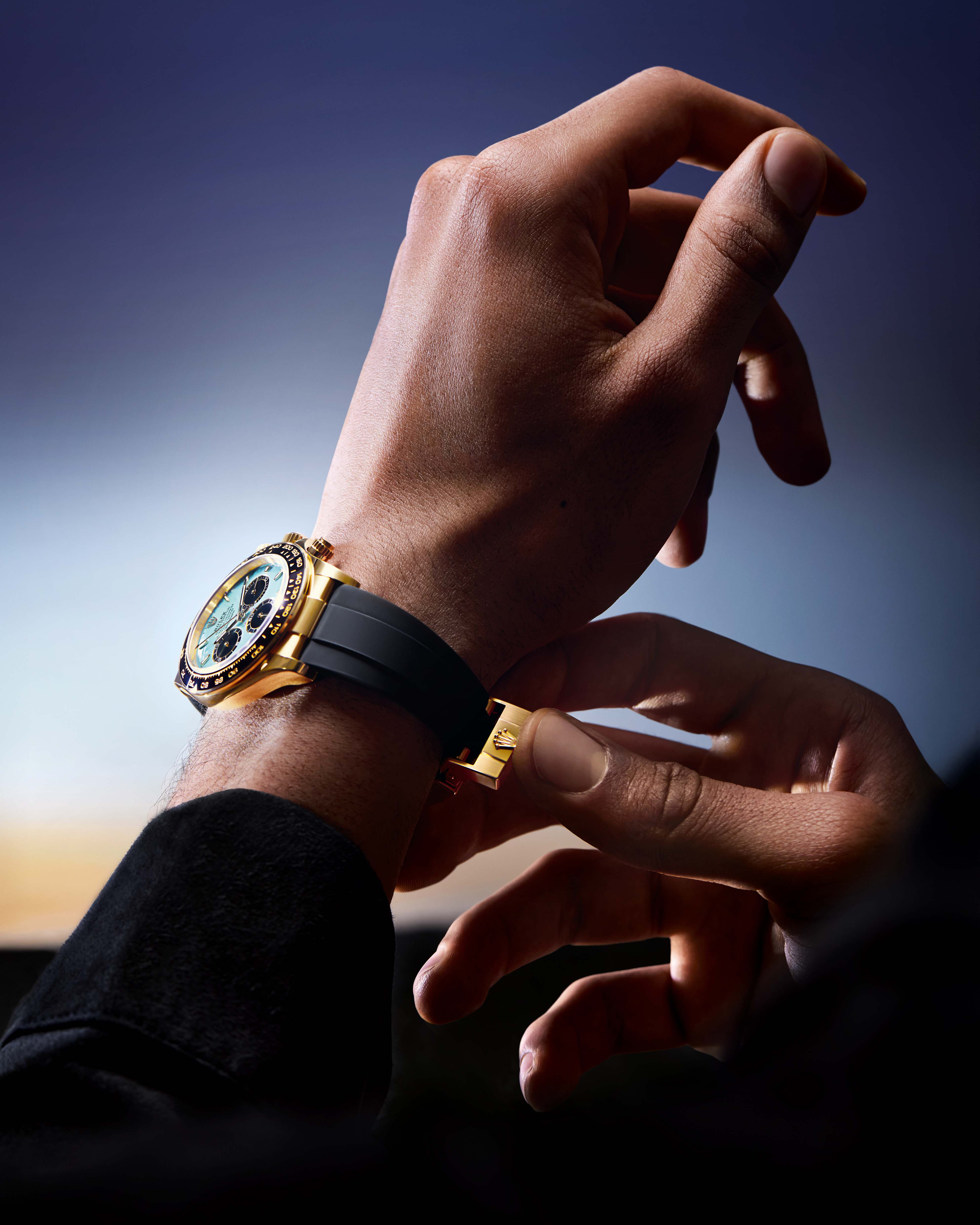
Rolex is known for its exquisite craftsmanship, which is eminently evident in the new Daytona iteration, unveiled at Watches and Wonders this year. From the high-performance chronograph movement to the meticulously sculpted case and bezel, every component of the Rolex Oyster Perpetual Cosmograph Daytona is designed to rigorous specifications. The tactile feel of the pushers, the balance of the dial arrangement, and the seamless blending of function and form attest to the iconic brand’s attention to detail.
Designed for professional racing drivers but admired by collectors and aficionados all over the world, the new Daytona exemplifies Rolex's devotion to quality, and aesthetic and mechanical perfection. There’s no denying the fact that the turquoise blue lacquer dial serves as the technical and emotional focal point for the watch, defining its character.

Challenge of Turquoise
In the world of watchmaking, few colours evoke as much fascination — or pose as many hurdles — as turquoise. This vibrant blue-green hue, reminiscent of tropical waters and sunlit skies, has a magnetic quality that can turn a timepiece into an instant statement. Yet behind its radiant beauty lies a demanding set of challenges that make turquoise one of the most difficult colours to work with in horology.
First, turquoise is a colour that demands precision. Unlike more neutral tones like black, white or silver, turquoise does not easily fade into the background. Thanks to its intensity, any flaw in application or imbalance in tone becomes immediately noticeable. Whether applied via enamel, lacquer or through natural stone, achieving a consistent and pleasing shade of turquoise requires a high level of craftsmanship. Even subtle variations in pigment or texture can disrupt the visual harmony of a turquoise dial.
The difficulty is amplified when brands opt to use actual turquoise stone for the dial. Natural turquoise varies widely in colour, matrix pattern, and structural integrity. Sourcing pieces that are not only visually consistent but also stable enough to be cut and set into a watch is no small feat. What’s more, the stone's relative softness and porosity make it prone to cracking or discolouration; in other words, turquoise needs to be handled with extreme care.
Colour pairing is another crucial consideration. Turquoise doesn’t match seamlessly with every metal or strap material. Stainless steel, for instance, can bring out its cool undertones while yellow gold can either clash or complement, depending on execution. Rose gold, bronze, and even titanium offer compelling combinations, but they all require a nuanced design approach to avoid overwhelming the eye. The strap plays a pivotal role as well — a poorly chosen leather or textile can throw off the entire aesthetic balance.
Then there's the matter of cultural perception. Turquoise carries a wide range of symbolic meanings depending on context. In Native American jewellery, it is revered as sacred and protective. In the Mediterranean, it suggests luck and vitality. In modern fashion, it's often seen as playful, summery, and bold. For watch brands, harnessing these associations can be a veritable challenge.

What Is Lacquer? And What Is the Process Involved?
Lacquer is a high-gloss, protective coating applied to a watch's dial to improve its beauty and longevity. It may produce a smooth, glass-like surface that enhances colours, adds depth, and provides a sophisticated appearance. The dials created in-house by Rolex use a painstakingly controlled process that combines science with artistry. The process begins with a brass base, which is meticulously cleaned and polished before being covered with many ultra-thin layers of coloured lacquer.
Each layer is precisely applied to ensure uniformity and depth, and then cured in controlled settings to cement the immaculate surface. What distinguishes Rolex from other brands is its exclusive lacquer solution, which was created internally to resist fading, cracking, and discolouration over time. This produces a dial surface with almost liquid depth and gloss. Whether it's the candy-bright hues of the Oyster Perpetual or the stark black of a Submariner, Rolex's lacquer process is about uniformity and longevity.

The Dial in Context: Framing the Movement
The dial transforms into a stage that frames the subdials and the trademark Cosmograph Daytona text with theatrical precision. Each element is precisely organised to catch the eye, resulting in a visual harmony that combines form and function. The subdials, which are often rimmed in contrasting tones, function like dancers in a mechanical ballet, measuring time with elegance. Meanwhile, the Cosmograph Daytona inscription grounds the composition, making a dramatic statement about legacy and speed. This interplay of design elevates the dial from being a plain display to becoming a symbol of performance and prestige.
In the world of haute horlogerie, where every detail speaks loudly, the Rolex Daytona's turquoise blue lacquer dial is a modest yet imposing success. A deliberate representation of Rolex's technical expertise and artistic restraint, the Daytona dial is both current and timeless, thanks to precision engineering and unwavering quality control; it takes the Daytona beyond its race roots, transforming it into a canvas of horological artistry.


